Every brand needs to be unique and memorable to its audience. Use these steps to build your brands awareness within the marketplace.

Every brand needs to be unique and memorable to its audience. Use these steps to build your brands awareness within the marketplace.

Flat design for the About HR brand, now live on their new website.
The About HR website is a responsive and conversion friendly website. Their three core services featured clearly underneath the main image and above the fold. The call to action and contact number in the top right hand corner makes it user friendly, and the contact details are always visible – this entices users to perform the action that is most valuable to About HR – call me! We love the flat design design, the simplicity of the structure and the colour!
We recently had the privilege of designing some tender documents for one of our regular clients.
This really got us thinking of how a well designed tender document can really show off your brand and ensure you stand out from your competitors.
Here are some important points as to why it’s critical that the design of your tender document is done right the first time.
These images show how beautiful your tender documents can be.
So everyone is talking about Google’s recent algorithm changes but how have they changed? Before reading any further go straight to the Google Mobile-Friendly Test to check if your site is optimised for mobile.
If you got a message like this then you need to make some changes to keep your precious search engine results.
Up until April 21st it has been possible for websites to perform well without having a mobile optimised site, but now that has all changed. Google is on the prowl for mobile-friendly websites and if you don’t have one you can expect to see a significant drop in your search results.
Not familiar with what makes a website mobile-friendly. In a nutshell a mobile-friendly site is a website that automatically changes it’s layout based on the device being used. To avoid being penalised, Google recommends a beautiful new responsive site. Therefore you will have a single website that will look AMAZING on your phone, tablet and desktop.
In return Google will reward your new mobile site with improved SEO. By investing in a responsive site you will also create a good user experience which in return leads to increased conversion rates and keeps your brand competitive.
Talk to us about beautiful, conversion friendly websites that generate qualified leads for your business. We would love to help you! Call us on 02 8399 2223.
We say, if you want to effectively showcase your brand, don’t try and make a template site fit. Square peg, round hole!
It is common for clients to ask, should I have a custom built or template website? Having your site custom built means stronger branding and number of other advantages:

It’s no secret that people respond better to visual information. So why not use icons to help communicate your message more effectively?
![]()
We are safe to say that every brand wants and needs a strong identity to stand out from their competitors. Well the first step in the right direction is to a create style guide – a bible for your brand!

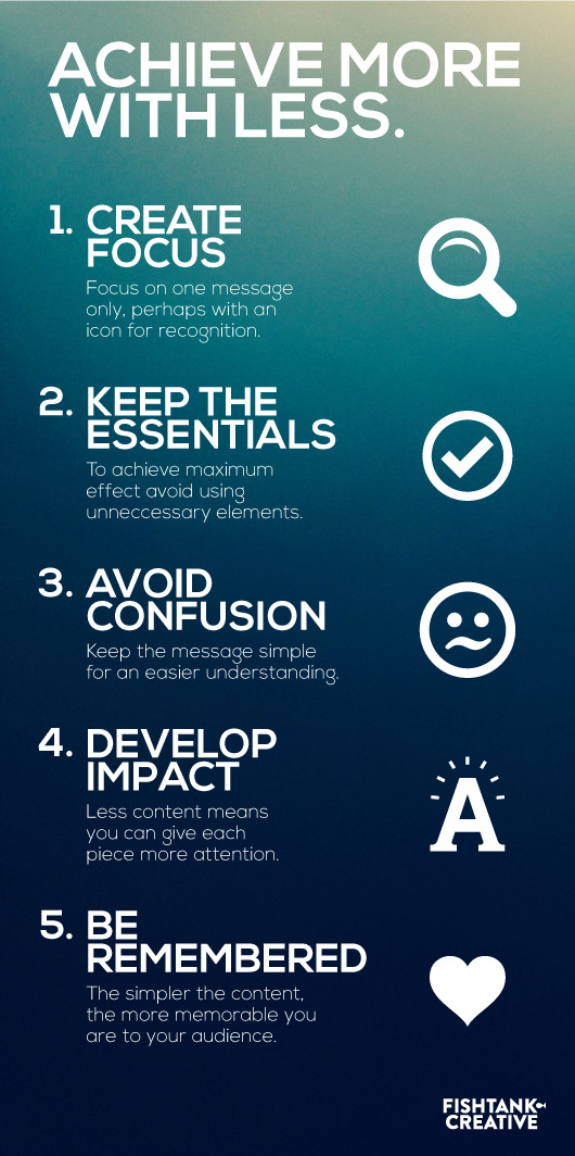
We all know the phrase ‘less is more’, but have you ever thought why?

Have you ever thought about repurposing your social media or blog content to extend the reach of your brand?
