Say goodbye to dated gradients, shadows and stroke elements; minimalism is here to stay. ‘Flat design’ is changing the way you communicate. When composed carefully, flat design is beautifully simple, timeless, clever and captivatingly appealing to your viewers.
Facebook changed their entire design icon scheme from 3D visuals to simplified, flat user-friendly icons. Google has followed suit. Apple’s iOS design evolved from realistic-looking 3D icons, to completely flat 2D elements.
The benefits of using flat design for your brand include:
- Readability – Your viewers no longer care to see fifty shades of gradients – they need simple and easy to use. Through flat design, we can easily focus the audience’s attention to directly where it needs to be, and rid unnecessary styling.
- Simplicity – Beautiful, easy to use interfaces, meaning viewers can get on with consuming the content or message without worrying how to use it.
- Efficiency – With potentially limited screen space, simple flat images, icons and colours makes the most efficiency of the pixels. Flat design simplifies the message as well as usability, and allows for it to be effectively communicated, no matter which way they choose to interact.
Talk to us about tweaking your brand to take advantage of flat design – we’d love to help you, 02 8339 2223.
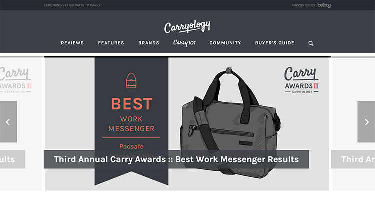
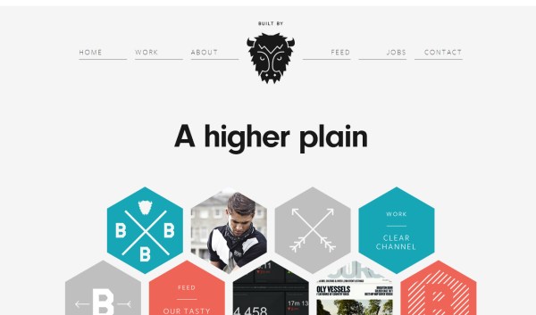
Here are some simple and clever examples we at Fish Tank Creative love: